Meet Nigel Jordan, graphic designer.

Nigel designed all the inside pages for the Read On books, include Lone Wolf.
Nigel is going to tell you about how he put the words and pictures together in the pages of this dark and thrilling tale.
Nigel says:
The design of a new book starts with the ‘design brief’ from the publisher. This gives me the basic information I need:
• Page size
• Whether the book is colour or black and white
• The number and style of illustrations or photos
• The age of the intended reader and
• The suggestions and requirements of the publisher.
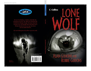
In the case of Lone Wolf, making the pages visually interesting wasn’t too difficult.
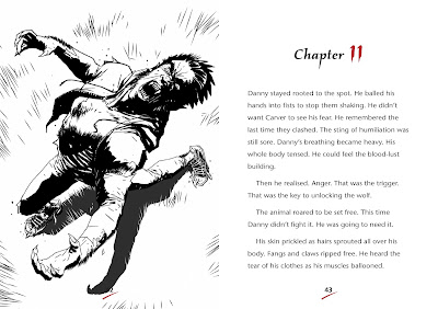
With Matt Timson’s stunning illustrations providing the main imagery, I had to ensure that the other graphic elements on the page, such as chapter headings and pages numbers, enhanced the look rather than detracted from it.
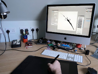
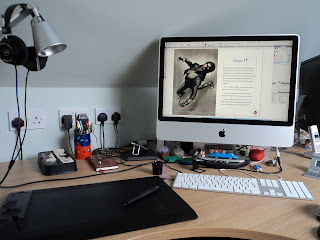
Nigel’s work station in his home studio, where he worked on Lone Wolf
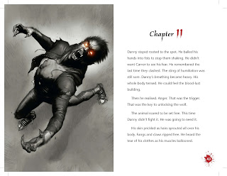
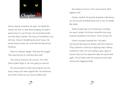
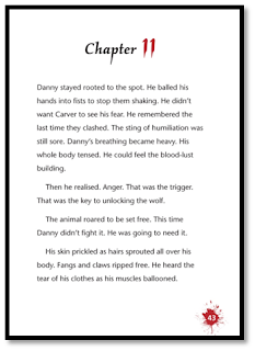
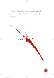
Where to start. A read-through of the author’s manuscript showed werewolves figured strongly.
A red and black colour scheme along with the illustration style suggested a ‘dark feel’ to the book.
Claws, teeth, scary eyes and blood, lots of blood – those were my first thoughts. I tried wolf eyes for the chapter headings and a single claw mark for the page numbers. Too fussy. The design evolved through a number stages and in the end both the eyes and the claw marks were replaced with blood spatters.
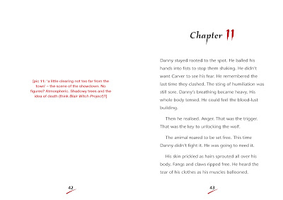

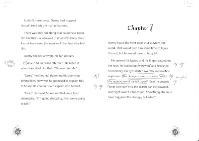
The author writes the story but sometimes spelling or grammatical mistakes can be left in. My first layout or ‘proof’ doesn’t include the illustrations or the graphics, just the words, so these can be checked.
This is then ‘marked up’ by the proof reader and I make their changes. In this way the text is refined so that it is the best it can be. After each set of changes I supply another and slowly the pages start to look more like they will when printed.
As well as looking at the appearance of the page, I also have to make sure that the text the reader is reading is a good size, using a clear and appropriate style of ‘font’*. There are a number of things which make a page easy to read and these include how many words are on each line and how far apart those lines are.
*There are many thousands of different fonts to choose from.
These can make text look very different. Compare the chapter headings in Lone Wolf to the main paragraphs. You wouldn’t want all the words on the page to look like the chapter heading – that would be very difficult to read.
When everyone is satisfied with the look and quality of the text, I produce a PDF (Portable Document Format) file, which is sent to the printer to be turned into the finished book.
– Nigel Jordan
Read more articles on Lone Wolf:
How a Book is Made – The Editor
How a Book is Made – The Illustrator
How a Book is Made-The Cover
How a Book is Made_Lone Wolf