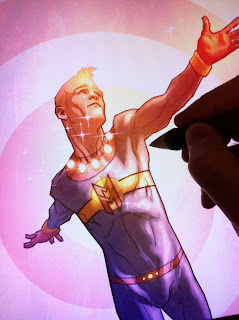
Meet Matt Timson, illustrator.
Matt drew all the pictures on the cover and inside the exciting Lone Wolf book.
Matt is going to tell you about how he brought this dark and frightening tale to life with images.
Matt says …
I was particularly excited about this project because I knew I’d be working on a book that I would’ve wanted to read when I’d been at school.
One of the things that I often disliked when I was a teenager was reading an illustrated story that had bad or boring art in it. The story itself is obviously the most important part of any book, but if you’re going to take the time and effort to include illustrations, why not make them the best illustrations that you can?
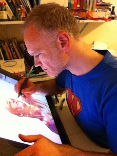
When I first started working as an illustrator, I worked on paper, with pencils, markers and paints. These days I work digitally, with several different drawing programs, and I use a Cintiq.
A Cintiq is a pressure sensitive screen that I draw straight onto with a special pen, in the same way that you would draw on paper. If I make a mistake, I can just hit ‘undo’ and draw my line again. This means that I can experiment more and don’t have to wait for paint to dry.
The ‘illustration brief’ I got from the publisher for Lone Wolf included a copy of the story for me to read, along with notes on the 14 full-page illustrations that needed drawing.
From this I produced something called ‘thumbnails’, which are tiny, rough sketches of what I think the publisher is after. These were my initial 14 thumbnails.
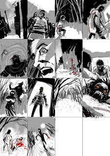
These go off to the publisher so that they can discuss what they think works and what doesn’t.
These are the second round of thumbnails.
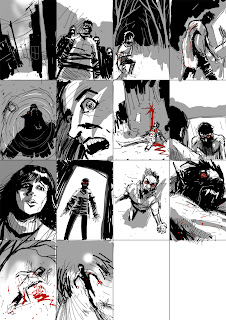
As you can see, there have been a few changes, but nothing too drastic. I was pleased that the publisher decided to include a picture of the boy changing into the wolf, as I think that’s what everybody really wants to see in a book about werewolves!
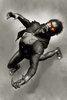
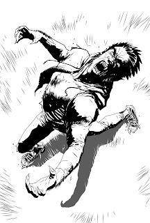
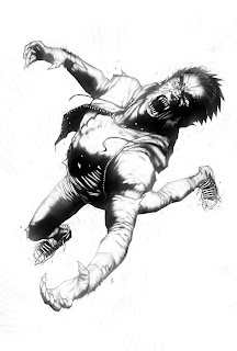
This was my initial line art, drawn in Manga Studio.

I sent this one back to the publisher and there was some discussion about whether or not he should look more human.
I was keen to leave it as it was – I think it’s more exciting to look at and definitely more fun to draw. fortunately, the publisher agreed!
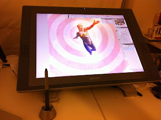
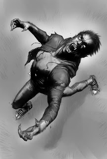
Here, I’ve softened all the line art in Painter and Photoshop.
Back in Painter, I added grey tones to make the figure look more solid.
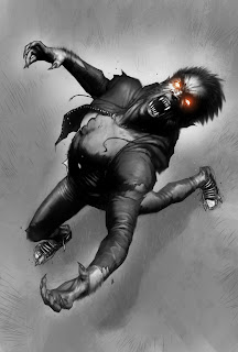
Back to Photoshop – this time I added more tone, texture and highlights, a layer at a time. By this stage, I was probably using around 10–12 layers! That way, if I made a major mistake, or just want to experiment with different ideas, I didn’t lose the work that I was already happy with and I could just delete the layer that I was working on.
This is the point where I would normally add colour as well, but the only real colour in this picture was around the eyes, so that’s all that’s on the colour layer.
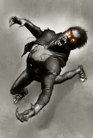
The last thing I did for this piece was to add a slight colour tint in Photoshop, which made the whole thing a bit less grey.
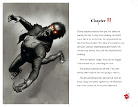
Here is the final product, and how it looked in the book pages!
– Matt Timson
www.matttimson.com
Read more articles on Lone Wolf:
How a Book is Made – The Editor
How a Book is Made – The Designer
How a Book is Made-The Cover
How a Book is Made_Lone Wolf