Transport for London has just released a new poster map to coincide with the London Olympics. The familiar stations across the network have been replaced by what are called ‘Olympic Heroes’. These include athletes and other people connected with the games, which have been arranged in lines which make up groups of people with a particular connection. The Olympics is providing a context that is being used in many geography departments this year. The Geographical Association is among the organisations that have produced activities based around the games:
http://geography.org.uk/projects/planetsport/london2012
 |
| (c) Shutterstock images |
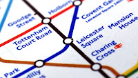
The original tube map was designed by Harry Beck in the early 1930s, and was based on diagrams of electrical circuits. Beck realised that if people were underground they didn’t necessarily need to know exactly ‘where’ they were, but how many stops and on which line they needed to travel to get to where they wanted to go. It’s an interesting opportunity to discuss how maps can distort the real world – something that geographers should be aware of. In March 2012 the BBC series ‘The Tube’ showed some of the secrets behind the organisation of this network which carries millions of people every year – a visualisation here http://spatialanalysis.co.uk/2011/11/tube-you/ shows how far the journeys made on each tube line would reach on a typical day.
Beck’s original map design has been much copied, and most underground networks around the world have a similar schematic map to help users navigate and find the correct line.
Apart from the obvious connections with transport, the tube map has also been ‘appropriated’ for various uses over the years, notably by Simon Patterson who produced a version called ‘The Great Bear’.
Other versions of the map have replaced stations with the name of musicians and bands, pubs in a city, rude words and food. A version has also been produced to show how the network might be affected by climate change and rising sea levels.
I have used the TfL website http://www.tfl.gov.uk/ to explore journey planning across the city in lessons, setting up scenarios for journeys that have to be made. Although geography is not about ‘teaching how to read timetables’ there is an element of this in the way that geography should prepare people for living in the UK.
The increasing use of Oyster cards has also generated a large amount of data on people’s movements across London and this could be used as a case study for the value of data, and the extent to which our movements are monitored by data capture and CCTV the minute we step foot in a large town or city.
The re-labelling of the tube would lend itself to an exercise in classification. Provide students with a list of terms which refer to three different processes e.g. those connected with rivers, glaciers and the sea. Some of them share similar names, or are similar processes. These would be placed where tube lines intersect.
Lines could be drawn using the freeform tool in Powerpoint and coloured keys produced to summarise the learning.
You might also ask students to ‘organise’ the tube line so that the first stops on the line were the earlier parts of a sequence which terminates at ‘the end of the line’.
A blank tube map which could be used for this activity, or adapted, can be obtained from the site of Geoff Marshall using this link:
http://ni.chol.as/media/geoff-files/sillymaps/blankedout_map.jpg
Students could also be asked to design a tube line with stops that relate to revision for forthcoming exams, or design a platform motif which summarises a particular term.
Another useful area for exploration in GCSE Urban Geography could be research into the development of ‘Metroland’ and the importance of the railways in the development of the suburbs as we know them.
The imagery of the Tube advertising, particularly in the vintage posters such as can be seen in this Flickr set:
http://www.flickr.com/photos/goldenlad/sets/72157603448879462/with/2108840531/ is also worth exploring. How is the city represented in these images ? Do they reflect the reality of living in London ?
Younger pupils could be introduced to the Animals that are hidden in the underground at: http://www.animalsontheunderground.com/ or challenged to find other animals and shapes within the pattern of lines.
A final stopping point could be this site which includes an animation which ‘morphs’ to show the comparison between the ‘actual’ geography of London and that of the tube map: http://fourthway.co.uk/realunderground/real_underground_small_750x525.html
Safe travels through these geography ideas, and mind the gap!
Copyright notice: The Tube map is the copyright of Transport for London.
Alan Parkinson
Secondary Curriculum Development Leader of the Geographical Association
